|
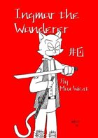
This almost doesn't qualify as a comic. It's just seven weakly-attempted panels that barely convey a story, intended to spam the artist's URL.
The entirety of the contents:
A blind cat stumbles past some wobbly lines and uninformative black shapes. A mugger points at gun at him (somehow, since the mugger lacks a thumb and the gun lacks a trigger). The cat pulls a sword out of nowhere (it's supposed to be from his cane but it's impossible to tell from the pose, angle, motion and linework) and kills the mugger off-panel. You get to see the mugger's twitching hand on the final page, where it looks like the artist drew the hand with a blunt-tipped marker. There isn't a single graceful, tapering line in any of these pages.
The artist needs to understand a story is only compelling if you care about the characters. Dialog isn't necessary, but clarity is, and very little here communicates well to the reader because form and shape are replaced with thoughtless linework. When going for a film noir style, texture and light and atmosphere must come into play, and those elements can't be faked or handwaved away with some wobbly hatch lines. Instead, most of the backgrounds here look like they were done in under 10 seconds, with no consideration at all.
My constructive criticism is that the artist should practice their craft and take it seriously before spamming Twitter with it. This is very amateur.
|