|
|

|
 |
| Other comments left by this customer: |
|
|
|
|
|
|
|
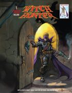
Witch Hunter
Staff: Vincent Ferrante, Scott & Victor Dominicis
Overview:
It rises above the preconceptions I had going in.
Review:
Wow, I seem to get into a lot of mythical beast hunter style comics this month. The last two were werewolf hunters and vampire hunters (Happy Halloween I guess). But that brings me to an interesting point point- we see this kind of thing a lot. I guess it goes back to characters like Professor Abraham Van Helsing and the like (lets be honest- it goes back WAY father but not in such a direct way). There is something very captivating about man conquering monsters. At it’s core it’s about man conquering himself and the fears that lurk in the dark. The tag line of this comic is, “Witch hunts aren’t about witches. They never were”. A powerful message and it sets the tone well for this comic. So with that in mind I am hoping Witch Hunter #1 from Monarch Comics cast a spell on me!
The art isn’t professional grade, but that doesn’t mean it isn’t decent. Something I really appreciate is that the first half dozen pages of this comic have no dialogue. We are introduced by a piece of parchment that says a family is wanted for witchcraft then we are told the story entirely visually. Fantastic. Absolutely fantastic. I keep saying that comics are a visual medium and takes advantage of this. However, once this ends- we take flight 114 to exposition town USA. We got what happened, we didn’t need an explanation. It almost counteracts the beautiful introduction. Otherwise, the art direction is rather inspired. Some very creative designs that keep the reader guessing if the creatures you see are masks or actual otherworldly entities during a masquerade scene. Even when the comic goes farther into fancy, they retain the creative character designs and build a very strange world. I rather enjoyed the character designs in a madam’s house. It felt like something out of one of Gaiman’s Sandman comics (which are fantastic by the way, so that is high praise).
Something of note is that I really didn’t like the protagonist’s character design. His outfit feels really disjointed. It swings from superhero to fantasy witch hunter. I guess that is the point but they clash a lot. The color pallet just doesn’t match. The purple and white looks fantastic but the dark blues & browns of the rest of his costume are way more down to earth then the “high fantasy” aspects of his outfit. I wish they would go one way or another with this because the basic concept has some real potential to it. The random white eyebrows on the mask I both love and hate. It gives him a mischievous look (which fits him) but sometimes it gets in the way of the character emoting. It reminds me of those pictures where people have drawn eyebrows on dogs a little bit.
Lettering wise this comic is hit and miss. The initial parchment with some text on it was abysmally bad. The in panel dialogue is legible, but a bit hard to read on occasion (the character width was a bit thin). On page 13 we also get this weird interruption where they stuck the credits. It is very distracting and I can’t imagine why they didn’t just do a credits page near the front. Add to that the near illegible nature of them (the thin white characters get lost on the dark blue background) and it is just a jarring stab to the eyes. The last eye-gouger is the name of the next comic on page 38. It looked like someone vomited all over the font and they just decided to use the colors they found it in to make a gradient. Come on! You guys are better than that!
The dialogue isn’t bad. It has some genuine brilliant moments, (“...and bring some milk and chocolate chip cookies.” “Why? Does he need cookies to find my daughter?” “No, he just likes them.”) but then it falls into mediocrity with some very cliche lines. A lot of “witty” characters (Nightwing, Spiderman, the Robins, Gambit, etc) fall into this trap. They try to banter but it just falls flat when a line doesn’t work. It makes them seem like their quips are coming from a place of ignorance rather than intelligence.
The ambiguity of the nature of some characters is a strong point. We are given this fantastic world and we are never sure if we should be employing suspension of belief or not. Are the witches evil? How about these random rich guys? Is witch hunters good or just in it for the money? It seems like no one has truly clean hands. Sometimes it seems like the comic doesn’t know, but I am giving it the benefit of the doubt that it will build upon this in future issues (I only review the 1st issue of comics).
So to recap, decent art, great use of that art, hit or miss lettering, inspired character design, lackluster protagonist design, dialogue that wavers between great and uninspired, and a story with some fun elements to it. I actually enjoyed this for the most part. I don’t know if “Witch hunts aren’t about witches. They never were” really describes this comic. It is totally about witches, magic, and their persecution. Hey, it’s free. Give it a read!
Metrics
Art: 7/10 (Decent art)
Lettering: 3/10 (Some narley fonts drag it down)
Plot: 6/10 (Decent with some good and bad points)
Novelty: 7/10 (A fun and creative world with inspired characters.)
Overall: 6/10
Review from: http://indycomicreview.wordpress.com/
|
|
|
|
|
|
|
|
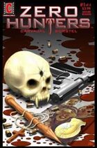
Zero Hunters
Staff: Jay Carvajal, Marc Borstel, Federico & Karina Lopizzo, and Carlos Razetto
Overview:
"Vampire" + “film noir” + “cop”. Follow that formula to the letter and you basically have everything in this comic.
Review:
So I’m once again on a vampire book. I’ve stated before that it’s a genre I’m not super fond of, but I’m excited to dig into it. Sometimes this genre surprises me, so let’s sink our fangs into Zero Hunters #1!
The first thing that grabs me is that this is a scifi and I’m a fan of the clean cut modern art style they use in this comic. The lettering is nothing shy of professional grade. There is excellent use of silhouettes (which fits with the tone quite well). Some of the character designs (particularly for some of the vampires) are quite cool, but others lack any real inspiration (including Garrick, the protagonist). This comic also makes great use of this color and takes advantage of the visual medium it uses. Both visuals and script skip happily across the pages of this free 34 page comic.
But I’m afraid that’s where the praise ends. The plot is very simplistic and exposition heavy, the art has a few slip ups (though is generally pretty solid), and the main character is forgettable. A few of the onomatopoeia bugged me as they didn’t exactly jive with the fantastic lettering.
A lot of the plot relies on film noir clichés and stock characters. You can see everything coming and nothing is really new or unique. It seems like someone threw a few darts as a board with ideas tapped to it and came up with “vampire”, “film noir” , “cop” comic. Near the end they get into this interesting plot point about how the protagonist and the antagonist are locked in eternal struggle across multiple lifetimes. A nice little twist, but it doesn’t save the comic.
Ultimately there is a lot of like about this comic but a lot of it falls by the wayside. The plot is cliché, but it has some saving elements. The art is good but it never really rises to the point where it’s noteworthy. The characters are blank slates, though at least they feel like people (through dialogue and action).
Metrics
Art: 7/10 (Decent art)
Lettering: 7/10 (Professional grade)
Plot: 3/10 (Nothing new)
Novelty: 3/10 (Generic)
Overall: 5/10
Review from: http://indycomicreview.wordpress.com/
|
|
|
|
|
|
|
|
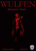
Wulfen Prologue: "Teeth"
Staff: Ed Doyle, Liam Kavanagh
Overview:
If werewolves are your thing, give it a read I suppose.
Review:
So today I’ll be sinking my fangs into a werewolf comic. The market is kind of saturated with vampire and steampunk stuff, but at least the werewolf thing came and went pretty quietly. Anyway, lets take a look at Wulfen Prologue: Teeth.
The art on this one isn’t shabby but it’s by no means approaching professional grade. It’s full color but lacks the consistency that comes practice. Sometimes the artwork it pretty decent but then it slips into laziness and it suffers a bit. It’s a shame because it really has the potential to be a very interesting art style. Maybe with a bit more refinement and attention to detail the artist behind this could be downright phenomenal.
The lettering bugs me a little. It’s not bad and it is legible but like with the art, sometimes it looks a bit sloppy. Letters getting close to the edge, things not centered correctly, a few obnoxious bright yellow narration boxes with black text that hurt my eyes a little. Oh and I’m not sure where to mention this so this is as good a point as any but their cover is 3-4 times larger than the other pages so it has the effect of shrinking the others by default (which is a technical issue so I won’t be factoring that into my rating).
Now the characters in the book are pretty one dimensional. We have Wulf, a werewolf hunting outcast werewolf due to the circumstances of his birth (replace “werewolf” with “vampire” and this sounds a little familiar...). The “villains” are generic and serve only as a sounding board for exposition and to demonstrate that Wulf is a badass. I mean he basically lays out all the broad strokes of his background to them while fighting them.
The plot takes a backseat, a wolf was captured because some hunters think it killed some kids. To be honest- I’m with the hunters by the end of this. They did their due diligence to check to make sure it was the one who killed the kids (fangs) and then Wulf comes bursting in and kicks the crap out of them. His rationale is kind of weak, (“Wolves only hunt for food!”*) and leave me kind of thinking that Wulf is an amoral jerk rather than some protector of the wild.
*From what I understand, this is more or less true but a-typical behaviors have been recorded in clusters of incidents. Heck, in 2013 alone at least 6 people were killed by non-rabid wolves.
A lot of the dialogue is excessively grim and contrived (“A mission ... of death!”) and sometimes made me kind of cringe awkwardly reading it. I mean, I’ll give it credit- it jumped full on into the vibe it was going for. Despite this, it still feel a bit short like maybe the author’s heart was infatuated with the idea rather than earnestly understanding the premise he was getting into on a intimate level.
Ultimately I am not really impressed with this comic. It delivers what as promised, but only goes through the motion. It feels like the team is trying to mimic making a comic rather than write a story. Getting caught up too much in tropes of the medium (particularly when starting out) leave a comic feeling kind of unpolished. Hey, know what though? They are totally vibing on this comic and if werewolves are your thing- you could do a hell of a lot worse. Give it a read.
Metrics
Art: 5/10 (Decent. A bit sloppy at times but a lot of love.)
Lettering: 4/10 (Few missteps)
Plot: 4/10 (Coherant but exposition heavy)
Novelty: 2/10 (Blade want it's premise back)
Overall: 3.75/10
Review From: http://indycomicreview.wordpress.com/
|
|
|
|
|
|
|
|
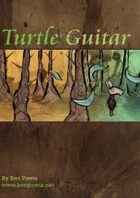
Turtle Guitar
Staff: Ben Powis
Overview:
Art in comic form.
Review:
So we have an odd little comic called “Turtle Guitar” here from Ben Powis. I don't normally read descriptions until after but the lack of a preview image kind of concerned me so gave it a read. It tells us that this is a 6 page comic so I was a little hesitant starting off. Let’s see if we can shake that hesitation with Turtle Guitar!
So first off the cover struck me as odd. It was done in a very NOT comic style. There is a heavy use of stroke-as-texture with thick lines and a very dark color pallet. It looks like some bizarre patchwork wonderland that is very surreal. I’ll admit- this intrigued at first and it managed to continue that surreal art style effectively all the way through. It put this comic in one of those “comics as art” categories that I don’t get to use all that much.
This comic is all about the art, right down to the lettering. I love how Ben used a change in font color to illustrate the impact of certain words (like “parched” and “dying”). It completes the medium and effectively uses the visual aspects of this medium to its fullest extent. This is a letter of lover to lettering.
The narrative is mythological in nature, drawing a lot of influence from old world folk stories. In this context it doesn’t have to make a lot of sense on the logical level, but it does on the moral/philosophical level. Ben easily navigates around a simple but effective plot with the skill of a master while including the phrase “Turtle Guitar” (in its literal meaning) nonetheless.
If I had a gripe about it was that the plot was in fact very basic. That plays nice with the artistic direction the writer was going for, but it does seem a little nonsensical at times.
Saying that this comic utilized its visual elements to inform the reader would be a drastic understatement. So seamless is the integration of the visual aspects into the narrative elements that you don’t think twice about why a word is in light blue or why that little squibble is visually representing music. It takes risks but every one of them pays off and fits together seamlessly. In 8 pages (not 6) Ben Powis did more for the argument that comics are art than the big publishers have done in the last 5 years. It’s a downright shame that this as been up on DriveThruRPG since 2009 and holds a 3/5. This is a masterpiece you can download for free. Why would you skip it?
Metrics
Art: 9/10 (Industry redefining)
Lettering: 9/10 (Love letter to letters)
Plot: 5/10 (Simple but does its job)
Novelty: 8/10 (Something new.)
Overall: 7.75/10
Review From: indycomicreview.wordpress.com
|
|
|
|
|
|
|
|
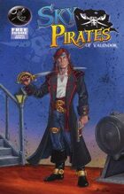
Sky Pirates of Valendor Issue #0
Staff: Everett Soares, Brian Brinlee, Michael W. Kellar, Jet Amago, and Cary Kelley
Overview:
It knows what it is and doesn't apologize, going full tilt into the world it made.
Review:
So we’re setting sail on adventure with issue #0 of Sky Pirates of Valendor by Jolly Rogue Studios. I am surprised that I haven’t come across more steampunky pirate indy comics yet. That might be because, while I enjoy the aesthetic, I am a bit jaded due to the media saturation following the deluge of all things steampunk and pirates that has hit me in the last few years. It’s kind of like zombies or vampires- I’ve just seen too much. That doesn’t mean I didn’t buy tickets for Abney Park and rock the hell out a few months back, it just means I’m a little hands off on the genre at the moment. That won’t stop me from giving an earnest review as I buckle my swashes and check out Sky Pirates of Valendor #0!
The comic itself is grayscale and while the art isn’t professional grade, it’s not sloppy either. There is a lot to look at in terms of detail and one can even overlook the faults. A few times the expressions didn’t match what they were saying but overall it’s not a terrible attempt, particularly for an indy comic. This comic does something a lot of comics do and have the characters just seem to kind of pose randomly (even in small ways) but it adds to the style and doesn’t do much harm (Marvel is terrible with this...). The real issue is when you start looking at the background characters. They are really poorly drawn sometimes and it doesn’t do the love I feel in this comic justice. It’s painfully obvious who the characters are and who is about to be killed off screen. It’s like super Red Shirt syndrome. If they didn’t get an intro at the start, they are totally expendable.
They drop you headlong into a plot via the first few pages. They are a little heavy on the exposition (“this is so-and-so my 1st mate and the only man I can trust”, “this is my wife”, etc). I suppose they had to do something as it is a bit of an introductory comic (being issue #0 and free for free comic day 2013) but it comes off as a little heavy handed. I do like the more stock fantasy races just kind of thrown in there with bear people and They make no apologies for the strong fantasy roots they have and let their hair down in terms of what liberties they take with the setting. For example, we get some very scifi weaponry at times but the main character prances around with a saber for no other reason than he is a pirate. While this works and makes a very magic-tech setting, it does leave the reader wondering a bit. I guess what I am trying to say is, it works and it doesn’t work because they don’t tell us much.
The lettering is fine. I never had any issue with it. I like how they have a bit of their own flare with the delivery of the narration. It has a jagged edge on the bottom like it was torn out of the page of a journal. The lines delivered via it also read like they were from a journal so it works out spectacularly.
Speaking of the dialogue, it does come off a bit frilly at times. The captain seems to talk like a pirate and think in a much more esoteric manner. While sometimes this could be used to effectively make a more complex character (a frequent trick of Grant Morrison’s run on Batman) it just doesn’t jive and we don’t get enough in-character dialogue to make the connection to this character’s more introspective musings.
I can get behind something that knows what it is and what it is doing. To this comic’s credit it is a lot of fun. You get what you sign up for- swashbuckling elves, bears with shotguns, airships, pirate jargon and that is exactly what you get. Cut it, print it, we’re good here!
Metrics
Art: 5/10 (Not pro, not bad)
Lettering: 6/10 (Readable and some creative use)
Plot: 7/10 (It knew what it was doing and did it)
Novelty: 7/10 (Fun little setting)
Overall: 6.25/10
Review from: http://indycomicreview.wordpress.com/
|
|
|
|
|
|
|
|
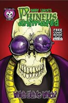
Phineus 36 Which Lich is Which?
Staff: Barry Linck
Overview:
Not much here.
Review:
So I just downloaded a file named, “Phineus 36 Which Lich is Which?.PDF” and I have NO idea what I am about to get into. The summary on drivethru just says “Rotwang rises from the dead, with hilarious results!” and I have no idea what’s going on. Let’s get to reading then.
Getting into the book we see it was for free comic book day 2012 and is apparently the sequel to a comic done earlier (sort of).
The art starts off very good but a few sloppy spots show up. I don’t know if it is the minimalistic style (think kind of Genndy Tartakovsky does zombie) that causes little errors to stand out so much to me, but they do. However, that’s not to say whoever drew this black and white comic isn’t downright talented, it just feels like he drew it in one go. We get a lot of linework and it looks like the medium was simply inked paper over some sketch work. This comic has its fundamentals down cold though, no questions asked. Great use of perspective, posing, and framing make this stand out pretty solidly. Makes me want to see a comic where Barry puts his heart and soul into it (pun pun pun).
The lettering is decent (almost professional at times) but we get these occasional errors too. Nothing that makes it unable to be read, just like word breaks of short words, odd letter placement, etc.
The story is, as described, a continuation of something I haven’t read (this is why I normally read issue #1s when I do reviews). The dialogue leaves a lot to be desired. It feels like the author was trying a bit too hard to be edgy and/or modern and it just ends up reading like a lot of swears for no reason. The comic is too short to really develop anything beyond, “I was dead. I am alive? I have a necromantic orb in me! I am a litch! I made zombies”, but I can’t really detract anything for it NOT being coherent (just a little pointless I guess). I won’t rag on it too hard though, I did jump in in the middle of a plot (I assume). I'm not really sure where there was any humor. It felt like the exposition as to why a character was back to life. Heck, the cover was funnier than the comic. Maybe I'm missing something?
Overall I didn't dislike it. There wasn't a lot to like either (art was solid though). I’ll just toss this one on the “Failed too impressed but not their fault” pile. Hey, it's free so give it a read!
Metrics
Art: 5/10 (A cut above the rest, few flaws dragged it down)
Lettering: 5/10 (Few missteps, professional overall.)
Plot: 4/10 (Can't say it wasn't cohesive?)
Novelty: 4/10 (I forgot it already)
Overall: 4.5/10
Review From: http://indycomicreview.wordpress.com/
|
|
|
|
|
|
|
|
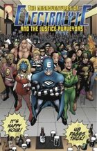
The Misadventures of Electrolyte and The Justice Purveyors
Staff: Patrick J. Reilly and Butch Mapa
Overview:
Go read it. Now. Stop what you are doing. Put down Batman and/or Superman and read this.
Review:
Alright, so there are times when I do this that I get really disheartened. But comics like RATO, C.U.P.I.D.S, and Slave all make it worth it. I go through so many bad ones that when I find a gem like The Misadventures of Electrolyte and The Justice Purveyors I get excited. And excited I am. This was a FANTASTIC comic that everyone deserves to read.
The art is top notch and at times even some DC/Marvel folks could take some pointers. The letting is the only place this comic is weak in and then that’s only at a few rare points (see the bottom of page 46 to see what I am talking about). That’s just a drop of water in the ocean though as this comic’s artistic investiture in the characters is wholehearted.
The real quick run down of this comic is that we are following a team of heroes with laughably bad powers who try to fit into a world where much better heroes exist. It sounds like a tired plot we’ve seen played for laughs a dozen times but these guys really hammer it home. The story has twists and turns galore, the characters are well written, the each feel unique, and the plot is engaging as well as coherent. I got a little Watchmen vibe from this comic, in a good way, and I really liked the protagonist. He almost lampshades the qualities of some other characters but the third act really hammers it home. There is a panel where all these heroes are just taking an elevator ride and “Age of Aquarius” starts playing. I stopped reading, put it on, and LAUGHED how well it fit.
It was totally an unadulterated FUN reading this comic. A lot of times I slosh through junk on my trek through the indy comic reject bin and I am wildly impressed with this book. It had smart dialogue, a lot of great twists, and I didn’t feel like I was painfully slogging through panels I didn’t want to read. Sorry for the short review but just go read it. You’ll get why I don’t want to spoil anything.
Metrics
Art: 9/10 (Marvel eat your heart out)
Lettering: 7/10 (Few missteps, professional overall.)
Plot: 8/10 (Smart dialogue and good characters.)
Novelty: 7/10 (Seems like a basic plot then BAM, twists.)
Overall: 7.75/10
Review From: http://indycomicreview.wordpress.com/
|
|
|
|
|
|
|
|
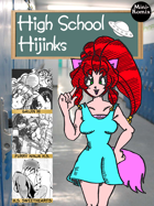
High School Hijinks
Staff: Jer Alford, Willie Jimenez, Amanda Garman, Bar-1
Overview:
An earnest attempt by non-Japanese to do manga.
Review:
I am not really just what I’m reading. Once again, I’m a bit out of my typical wheelhouse, but I soldier on. The first page looked promising at first until I realized that the artwork in the background was stock art of a high school. Well... let’s not judge a comic by it’s cover and jump into “High School Hikinks”.
The first page here tells us there are three stories. Gaijin HI, Furry Ninja H.S., abd H.S. Sweethearts. I’m going to play a game and try to guess the plots of these before I read them based on the teaser panel. (lets see how I do). One is about a weird foreigner in a typically Japanese high school who has a bizarre twist, the second on the list will have little to do with actual high school and more to do with ninja bunnies, and the third will be a rather emo one about two students falling in love.
The first comic, “High School Sweethearts” starts with a piece of artwork drawn on line paper and is by someone named Willie Jimenez Aka “Idest”? (Seriously, couldn’t tell what it said.)
The art style looks like someone tried to adopt the manga art style but had little to no formal training in art. The opening dialogue and scene was painful to read and watching the two main characters awkwardly pose while they talked was even more so. Lines like, “...but girls are watching me.” “Yea yea, quiet... here comes one now!” or “I’m sure you know me as Jessie. The coolest kid in school.” show a lack of understanding the fundamentals of writing. We know there is a girl. People don’t refer to girls as a gender, but the individual (It’s like having your dad walk up and your brother say, “There is a father”). And some of the reactions from teachers... it’s bizarre. We also get a very bizarre set of facial expressions in this comic where, even for a comic done in manga style, their reactions are totally overblown and at time inappropriate for the panel. I understand trying to portray sadness or loneliness but subtlety is the name of the game. In this comic we are beat over the head with it. The art in this comic suffers from a lack of understanding anatomy. Manga is stylized and this one is too, but proportions need to be maintained between panels and relative size should established early on and continued.
In short, it was a kind of a mess, the plot was a contrived romance between two high school students, and the art was poor. 1/1 in my predictions!
Mini-Metics
Art: 2/10
Lettering: 4/10
Plot: 1/10
Novelty: 1/10
Overall: 2/10
The second one is “Furry Ninja H.S”. (It’s a little weird that they are out of order). The first panel says that this is based on “Ben Dunn’s Ninja High School”. I had to look it up. Apparently it is a comic series I haven’t read so I am going to excuse some stuff on this comic as a result. Now, I’m not a huge furry fan, but I can get it. Different strokes for different folks and by the end of the first few pages this already looks a lot better the “High School Sweethearts”. I know well enough that this isn’t my area of interest, but the comic is cohesive, they don’t waste much time on exposition (something even professional comic writers have an issue with) and I can tell the characters by their introductions. Then we jump into some random robot fight without much explanation, but it fits with the tone of the comic (and I don’t know NHS so I assume it’s a “thing”). A crazy furry... ninja... alien... fight ensues (just roll with it) and then it descends into complete and wonderful chaos to the point that we need a 1 panel continuity reset after some bad pop culture references and a 4th wall break.
This one... well it gets a pass because it’s crazy. Art is half way decent, just shy of pro level, and is looks good even if it’s not my thing. (2/2!)
Mini-Metics
Art: 6/10
Lettering: 5/10
Plot: 4/10
Novelty: 3/10
Overall: 4.5/10
The third one starts off with a good ol’ fashion rustling of my Jimmies. This ones features some terrible lettering and the name “Gajin”. Even when played for parody, Japan’s zenophobia (stemming for it’s long isolationist period) is never something really that needs to be highlighted. I feel it’s somewhat akin to naming a comic, “Jiggaboo High School” in some respects. It’s a slightly derogatory term (ok Jiggaboo is a really offensive term... I just like the way the word parts sound) that gets used with an almost positive connotation.
Anyway, the comic has the footprints of someone who isn’t from Japan trying to write a story set in Japan in a Japanese style. It would be like if someone from Japan tried to remake Boy Meets World or the Little Rascals (Topanga would of course be a busty space alien ninja cat girl with a crush on the unassuming shy geek Cory who has a special power). I’m not saying that an American can’t write stories set in Japan but you need to write from a place you know- not try to imitate something you don’t. This results in a world that is neither here nor there. The dialogue is childish and formulaic, the characters are stock, and the plot is the plot from every harem anime you’ve ever seen. The art is a painful attempt to imitate drawing a style they were not trained to draw. (3/3!)
Mini-Metics
Art: 4/10
Lettering: 1/10
Plot: 3/10
Novelty: 1/10
Overall: 2.25/10
Also, the last page looks like Lisa Frank threw up all over a manga.
As a whole, this book was really schizophrenic. It had some decent parts (Oddly enough, “Furry Ninja H.S” wasn't bad to my surprise) but the other two were straight up painful to read. It feels like some friends who liked anime got together with these “three really cool ideas” and tried their hand at making something they had no business making. The failure in tone, story, and character development permeates so many levels of these comics but it’s magically how they manage to make it cohesive. If this is your thing- go for it. You are going to like it either way. It really seemed like a lot of passion and effort went into this comic. They really are passionate about what they do and I salute the hell out of them for that... however, anyone reading this will be hard pressed to wipe the armature fingerprints off this one.
Metrics
Art: 4/10 (Varies but in favor of bad. B&W by the way)
Lettering: 3/10 (Decent in some, really bad in others)
Plot: 2/10 (Directionless)
Novelty: 1/10 (A lot of tired plots)
Overall: 2.75/10
Review from: http://indycomicreview.wordpress.com/
|
|
|
|
|
|
|
|
Servant
Staff: Geoffrey Borgonia, Gilbert Monsanto
Overview:
Inoffensive, but offensively inoffensive.
Review:
The art is...well… more poser 3D art (I see a lot of this on DriveThruComics). However, I will give more credit to this team. They don’t make the same mistake that every other comic I’ve reviewed with poser art has made. The scenes are full of characters and “things” rather than taking place in ghost towns where only the characters exist. My fingers keep freezing up as I try to type these words, but… I’m actually ok with them using poser art. Like this is how it SHOULD be used. I’m not saying I love it or that it really brings anything other than having visuals to the comic, but I don’t spontaneously vomit when I see it. It could probably benefit from some actual artwork (something hand drawn or digitally made) but it’s passable. They use dynamic poses, have decent compositions, and I do like that there was a bit of post processing on the images and that all the models are not the same base male/female model with a few characteristics switched up. The massive chest of the protagonist is a bit much, but they play that for laughs a few times so it doesn’t really detract. There is this weird effect where you can always see the ripped abs of the protagonist through his shirt and it looks like they are vacuum formed to him chest.
Gerry Alanguilan did a pinup of the main character and it is at the end of the PDF and… wow. It is downright gorgeous! It just stands in stark contrast to the rest of the artwork in this book. With THAT sort of artwork this book would have knock it out of the park rather than just being average. It seems like this book being “average” is a recurring thing with Servant #1.
Lettering is nothing special, but it fits the vibe of the comic and I can read it without having to zoom in. It gets close to the edge every now and again, but it doesn’t ever tread close to being “bad”. A few times letters were oddly clipped (see page 12, last speech balloon) but it never made it unreadable.
The dialogue is a bit cheeky, which is a nice turn. It does this thing where the narration comments on what is happening (“Oh look, that comic store is having a sale! I’ll have to go check that out later.”) and it is a little out of place at times. A few times the author uses to describe what the acronyms being used mean and that would be fine but does three on the same page (so we have , **, and *** all in 2 speech bubbles). It kind of broke the flow a bit.
Once we hit about page 10 we get introduced to the villains and oh boy does their dialogue get bad. We had some decent lines before that felt like we had a human narrator, but now we get the most chalky, dry, genetic, villain dialogue I've had to swallow in a while.
Issue #1, like a lot of the series I read, is an origin story (for new readers: I only review the 1st issue of comics). A lot of times I feel like I’m a bit too hard on the amount of exposition crammed into 1st issues, but then I remember comics like “Slave” and I feel secure in my knowledge that people can inform the reader without cramming exposition down our throat. In this one, it almost lampshades other origin stories, but it feels a lot like a superman pastiche (last son of a dying world and all that) so it doesn’t gain any points for originality in that department. Then again, his name is even Gal Ang... which is totally not Kal El or anything close...
To be honest, it doesn’t jump out and grab me. The story is predictable and while sometimes that doesn’t detract from it (see Pacific Rim for example) this time it does. It’s a bland origin story about a guy who is a mash up of a few different origin stories that doesn’t really feel unique or interesting to me. Don’t get me wrong, nothing really is wrong with it, but nothing really jumps out. As a medium, storytelling doesn’t need to be sensationalist but it does need to convey something that we haven’t seen before. The morals are drawn from things like the most recent Superman, Batman, and Spiderman movies (you can becomes a symbol, serving a greater good, etc), the origin is all but borrowed, the main character is pretty genetic (geek, family values), and even the powers lack a creative “umph”.
A cool little thing this comic did that I would like to see more do is offer multiple forms for download. They had the standard .PDF (which I normally read), but they also had a Comic Book Reader and E-book format that people could take advantage of. That’s how you do it!
There is a lot to like here but most of that is just because it does the bare minimum to get by. It feels like this is the kind of comic that, if it were an employee, would be the sort of employee that goes to a 9-5 job and just clocks in and clocks out. There is nothing really special or unique about this comic other than not really being “bad”.
Hey, it's free. Give it a read.
Metrics
Art: 5/10 (Decent. Bonus for Gerry Alanguilan's pin up)
Lettering: 4/10 (Few errors. Good overall.)
Plot: 4/10 (Predictable but fine)
Novelty: 3/10 (Been done but not in this particular way. Bonus for extra file types)
Overall: 4/10
Review From: http://indycomicreview.wordpress.com/
|
|
|
|
|
|
Creator Reply: |
|
Thank you for the honest and in-depth review, Scotty! I apologize if it took so long to respond as I've been caught up with other matters (which is also why the third issue is massively delayed).
Just to respond to clarify a few things: yes, the story and overall plot is relatively cliche, but that is intentional. Embracing the tropes rather than "reinventing the wheel", so to speak, is a key element in this romp. That includes the cheesy dialogue when it comes to the villains (note how the scenes with the "Mighty Ruler" and his cronies in silhouette is rather cartoonish compared to the proportions of the rest of the book). While there will be some seriousness, this book will never take itself too seriously but nor will it be too comedic (though truthfully, that's difficult to pull off in any stretch).
Regardless, we really appreciate the feedback, and thank you for pointing out the strengths and weaknesses. Hopefully, we can improve on them as time goes by! ^_^
~ Borgy
|
|
|
|
|
|
|
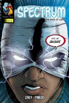
Spectrum
Staff: Draegon Grey and Alfonso Pinedo
Overview:
Big build up, big let down.
Review:
When the description provided for a comic starts with, “A new black superhero now endowed with special powers…” makes me cringe a little. I know every culture needs heroes they can identify with, but it kind of feels like that when your strongest foot forward is to appeal based on the race of the character… it’s kind of a weak start.
So the art. It’s strong, but not professional grade. It’s close and definitely seeks to be done in that style, but it doesn’t quite hit that level. They use a very bright color scheme and it gives it a bit of a closer. The lettering and onomatopoeia are in top form so nothing to complain about there.
The comic also comes with a little youtube video. It’s mostly done with low resolution stock images and tells about all the awards this comic won and praise it got. I don’t get why they don’t show off the artwork of the comic- it’s fairly good.
So far, so good. If it was all this well put together it would be a solid comic I’d be putting on my “Indy Comics Worth Your Time” list. But then we get to the story and dialogue...
The video claims that this was written by a master storyteller. If that’s the case, we need to reevaluate the metric by which we judge what a “master storyteller” is. The dialogue is filled with sloppy exposition (Unless everyone stands around declaring the start of a new semester out loud). The premise is a bit week. Boy struck by lightning and put into a coma for 15 years. Now he’s up and about (no mention about the detriments of being non-ambulatory for 15 years in the physical or mental realms…). This magical lightning bolt has given him ill-defined lightning powers.
The intro comic gives us a scene set in genetic-town high school (which is actually a college) with every tired trope and stock character in full attendance. By page 5 I could tell who the love interest was the bully who gets beat up in a few pages, and the hero were going to be. Their introduction was about as subtle as a freight train going off the rails.
A comic that takes its time and introduces elements with a careful hand wouldn’t have come across so rushed and messy. Stop me if you’ve heard this one, “jerky bully picks on geeks and hits on female classmate while a shy outsider protagonist looks on”. I don’t feel like Ulysses (the protagonist) is a real person. I feel like he’s an amalgam of tropes the author liked. He doesn’t show anything akin to fear so his inevitable victory is lacking in impact. We don’t get to know who Ulysses is. He’s a blank slate. I’m sure he grows a personality in later comics, but right now all I know about him as a reader is he defends geeks from being beat up and got struck by lightning.
All and all I’m really disappointed in this comic. It was built up as this big, groundbreaking, comic but it was nothing but another genetic superhero comic. Also, this character seems a LOT like Static from the late-great Dwayne McDuffie (except Virgil had some personality). I hope the rest of the series is better than this one because the creative team seems to have a big vision for this character. I’d LOVE to see something more from this team, but I don’t think I was sufficiently impressed with this issue. Don't take my word for it though. Give it a read. It's free!
Metrics
Art: 7/10 (Just shy of pro grade)
Lettering: 8/10 (Wish more were like this)
Plot: 3/10 (Amounts to nothing but fluff)
Novelty: 1/10 (Been done before. In several ways.)
Overall: 4.75/10 (Art caries this book where the story fails)
Review from http://indycomicreview.wordpress.com/
|
|
|
|
|
|
Creator Reply: |
|
Scotty,
Thanks for the review. I guess it is very hard these days to bring into the comic world a new superhero. The expectations and comparisons are very high. How do you create a superhero initially without giving the kitchen sink all at once. Is it possible to start out slow and build?
The intent was to start out the story with giving brief history and bring more into development. Don\'t know if you can bring something entirely new, never been done before these days. The hope here is this will be the case. Time will tell.
Did you happen to read the Vol 0.5? There is a plan for Spectrum for sure that will make it stand out from the others.
More is coming. Again thanks for the critical review. Although difficult to hear, important to consider within reason. |
|
|
|
|
|
|
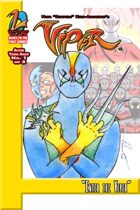
The Viper
Staff: Nana Kumi-Amankwah
Overview:
Simple art, simple story
Review:
So The Viper is apparently from some “blast from the past” line. The cover strikes me as if it were something drawn by a child. However, looking closer it’s not as bad is looks. I guess I’m just spoiled on digital paints from some of the better comics. Oh, well. Let’s jump into “The Viper”.
So this comic is drawn in a certain style that is very simplistic. The eyes are a little offsetting but otherwise the style pulls off a very “clean” approach. Heavy use of stroke really works to the comic’s advantage. Then again, simplistic is simplistic. The story and the style are at odds with one another and it would have really benefited from a more realistic approach. At times I felt like I was watching a puppet show or that this was set “In the City of Townsville!”. The quality fluctuates. At some points is really good while at others it’s total amature hour. Consistency is key in comics (despite how the major labels approach it…) and when we get some weird quality fluctuations it results in the remembering the best and the worst of the comic pretty vividly.
One this this comic did that surprised me was on page 6. They “hung” a single panel at an awkward angle in the center of the page. That really worked and showed an understanding of the emotional impact that would have. It’s jarring, out of place, and has a lot of negative space. Then again, that was the impact I assume they were actually going for.
Now the dialogue is not so much “bad” as it is “stale”. Things are said without much meaning other than to pass the time until a plot point can come along and it’s almost conscious of this fact.
We have this omniscient narrator who seems to be walking us through this story, but it feel almost like they shouldn’t have had this. Something a lot of new comic writers miss is that comics are a visual medium as much as they are a written medium. Ideally, we shouldn’t need a narrator present to explain what’s going on. Now one could argue that his was a stylistic choice, but I think the narrator wasn’t effective and actually detracted from the piece.
We also have this need to monologue to offer exposition. I know some characters are given to doing this, but find a clever way to do it. Think of how Rorschach, Batman, or Punisher self narrates. We don’t need literally dialogue explaining every stroke of the simplistic plan your villain just pulled off. People just don’t talk like this. At some point a character just offhandedly brings up a recent major life event and his friend is like, “Oh crud I forgot”. Come on! That’s just shoehorning back story in there! Either set it up better or wait until it’s a natural time to interject it. You've got your narrator on speed dial, why not use him?
The letting is up to par, but we get these blocks of text sometimes. You shouldn't have more than a sentence in your dialogue balloons. To be fair, we get a lot of this from the narrator rather than the characters.
To wrap things up, the art is unsuccessful, the dialogue fails to deliver anything beyond stale exposition, and the plot is handled about as delicately as Michael j Fox with an Etch A Sketch. I think a lot of love when into this, but not a lot came out.
Metrics
Art: 3/10 (Simplistic, but not effective)
Lettering: 5/10 (Legible but walls of text sometimes)
Plot: 2/10 (Contrived and simplistic)
Novelty: 3/10 (One moment of brilliance doesn't make up for the rest)
Overall: 3.25/10
Review from: http://indycomicreview.wordpress.com/
|
|
|
|
|
|
|
|
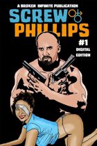
Screw Phillips
Staff: Jake Estrada
Overview:
Bad tracing, half way decent story
Review:
The tagline of this comic explains that this comic is about an agent who got greedy and locked up. Now he’s out and working the system. Fair warning, this is not a kid friendly read.
Now the art in this one is a bit off putting. It looks like tracing, though it kind of fits. Like tracing always done, it gives us these WEIRD facial expression (see the bottom of 4 for what I’m talking about). Tracing always carries this bizarrely off putting appearance where some things are detailed and TOO perfect while other things are sloppy (example: See page 5 and look at Screw’s neck vs his thumb in his pocket). People are also always posing because that tends to be the way a lot of stock pictures are.
The dialogue seems like something out of a porno and matters about as much (“Hey, foxy mamma...” “wanna go for a walk?” “sure”). It doesn’t seem like this real people would say. This clashes with the realism they are going for in the art. Sometimes it’s obvious when they used two different images (see Screw’s head on page 13) and it really just looks sloppy. Also, tracing has this habit of not always syncing expressions with the scene they are in. I’m not saying tracing can’t be done effectively, but you really need to take your own pictures to trace from or something.
The letting is actually very solid. However, the issue is that sometimes the dialogue continues to another panel with no indication. This makes for a very awkward read sometimes. The few uses of onomatopoeias don’t mesh with the rest of the comic.
Something weird about this comic is that only 17/30 pages are dedicated to the Screw Philips comic. The other are two other comic intros (which I will not be reviewing here).
Overall, despite the jarring art, it’s not a bad comic. The plot makes sense and is actually even engaging at time.Though they give you a little tease at the end, they plot doesn’t really grab me. It’s not a bad story, it just isn’t a good story. A lot of it feels rush or contrived for some set pieces he wanted to put in. Anyway, give it a read if guns & hookers are your thing.
Metrics
Art: 2/10 (Tracing and not the good kind)
Lettering: 5/10 (Good but some sloppy edits and onomatopoeias)
Plot: 5/10 (Decent but forgettable)
Novelty: 4/10 (I haven't read another comic like it but not new)
Overall: 4/10
Review from: http://indycomicreview.wordpress.com/
|
|
|
|
|
|
|
|
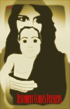
Testament Comics Presents
Staff: Michael Matlock
Overview:
Abstract Jesus comic.
Review:
It’s Jesus time. I’m talking old school Jesus style. Tonight I’m reading “Testament Comics Presents” and I think I’m in for a good one. Now, I can’t be hard because it was clearly inspired by the J-man himself. I’m expecting this to be as good as the 2nd coming is cracked up to be so let’s jump in and hope we get raptured!
Well divinely inspired the first page is not. There are 12 pictures that offer fractures of gospel that when read... don’t actually form a coherent message. It leaves me a bit confused and the various art styles leave a lot to be desired. But then I hit page two and it all makes sense. We get 70’s hair Jesus and he is rock’en what looks like a kung fu stance.
But in all seriousness, the art style keeps shifting so this makes me think it was meant almost as an abstract piece. They are highly stylized with some adopting almost a minimalist approach. The consistency of color vs black and white is a bit off putting. This is one of those rare instances where I can’t tell if it was intentional or is terrible. It’s either the most disjointed comic I’ve ever read, or the most artistic and abstract. The more I read, the more I believe the latter is true.
Page 11 informs us that the preceding story comes from the Gospel of John (Chapter 1, Verse 1-14). The first part serves almost as a visualization of the gospel’s themes and messages. The visuals tied in nicely with what was saying and served as a visual aid for some of the more divisive phrases.
So the lettering is weird. However, what isn’t in this comic. For the most part it’s legible, but lettering should serve to enhance the comic rather than to simply convey the message. Some of the text however is near illegible due to font choice. They use a very serifey high gothic font style with what looks like a thick stroke to break up the chapter and at one point I thought the next part would be an excerpt from the book of “Rebelation”.
Chapter two introduces us to the use of type as art and, though creative, is totally unable to be followed. The illustrated story is chapter 1 of the book of revelations, but I can hardly read it. The comic flips from a vertical to a horizontal format. I had to crane my neck to try to read it and eventually I just rotated it. Now there is some scary imagery in here if you take it as such. I had some music on in the background when reviewing this that probably didn’t help- but even without it there is some very bizarre and unsettling images (tall, thin, faceless people in long black robe and a crazy-eyed Jesus come to mind... and will remain in my nightmares). That’s not to say the art is bad. It’s good... I think. It is also REALLY abstract.
Story two ends with the creepiest baby I have ever seen (and I am comparing that to the baby from Kinesis so...). It is also accompanied by another shift, this time back to vertical formatting. I should not now that this book really could have benefited from a person savvy with layout. Borders are shown, things don’t line up, and a lot of the confusion over whether this is abstract or bad comes from sloppy editing. Things are drawn beyond the edge of the panel so it cuts off sharply.
So to wrap things up... this is a weird comic. I don’t think it really benefits from the medium. It would be better displayed as an art gallery installation than a PDF. I think I’ve decided that it is meaning to be abstract and possibly a little unsettling and not just bad. That doesn’t excuse the poor editing and terrible typography.
Metrics
Art: 6/10 (Minimalist, abstract, and weird, but well executed)
Lettering: 2/10 (Terrible)
Plot: 1/10 (I couldn't read most of it and it wasn't really a "Story".)
Novelty: 7/10 (It's weird and crazy... but no one has done it before)
Overall: 4/10
Review from: http://indycomicreview.wordpress.com/
|
|
|
|
|
|
|
|
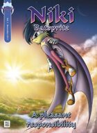
Niki Batsprite
Staff: Francesca Urbinati & Daniele Garbugli
Overview:
Not my genre, not even my language sometimes
Review:
This is a hard one. It’s one of those reviews that tosses me into something that I totally wasn't written for me or my demographic.
Opening it up I get a few very manga-esque pictures with cute fuzzy creatures and that’s not something that gets me. However, judging it purely on it’s artistic quality, they definitely have an established style and it’s pretty detailed. I’m not going to say this is major publisher quality work, but it’s somewhere just outside the ballpark. They have a style and they stick to it and do it well. Just because I’m not a fan of the style doesn't mean I won’t appreciate a lot of man hours of work and some real talent.
The story starts off with a Star Wars riff and that sets the tone quite well. The dialogue is a bit exposition heavy (letting us know that one character is a “rising star”) but when aimed at younger audience, sometimes you need to explain this a bit more. Another odd thing is that the characters keep using each other’s full name when talking. I don’t know if this is a stylistic choice or if they genuinely don’t think we can tell who “Niki” is if they don’t say “Niki Batsprite”. Then again, some people don’t actually have names. Like we have Niki Batsprite who is always called by her last name and then, “Penguin Guy”....
It’s a weird disconnect.
The lettering is a bit amateurish. It seems to not have that polish on it that would make it really good, but it does seem to manage to keep itself on the right side of being bad. It’s legible and that’s where it counts.
We have a hell of a lot of very odd sentences like, “You better appeal to your fifty percent of goodness and let me win” or “To jeer at visitors makes you escaping from boredom”. The introduction says they are doing this comic in both English and Italian. Maybe they did this in Italian first and tried to translate it to English? Either way, it’s really disruptive. To be fair, it’s not an issue on every page and you can generally tell what they are saying even at the worst of it. However, this limited grasp of the English language stifles what could otherwise be a decent plot.
The story is a both simplistic and confusing. It’s a pretty straightforward plot but it’s over explained at some points and almost comically under explained at other points. For example, they go into great detail explaining how “acrobatic flight races” work but then show the finish line and say, “...it’s important to cross the finish line to get some other points”. I’m not sure if it’s the translation or if they are just saying, “...and they get some ill-defined amount of points, or something.” They also talk about having “goodness” and “meanness” (in exposition) but it’s kind of just an abstract concept. I mean we see some mean people with “100% goodness” so it doesn’t really mesh well as a moral thing. Did it mean “light powers” or something like that? Niki mentions that he can’t really love or hate anyone but we see plenty of hate from that character. A character even brings this up but Niki just says, “Yes. I can hate”.
...and, until page 22, I thought Niki was a girl. It’s never really defined and he’s a pink & purple bat with eye-shadow so I just assumed...
Looking back, it’s not a BAD story but it just kind of feels bland; even in terms of other things I’ve read in this genre. It feels like it draws a lot from the Sonic fandom and has a lot of the trappings of a similar plot. Mystic stones, a far off world, racing, etc. The story itself has bizarre pacing that kind of waists time in every place. If these were complex characters in the middle of a long established franchise you might be able to write things like this but it feels like they want us to start off understanding the characters. It forces the reader to rely on whatever few personality traits we are give time to latch on to. This, in effect, simplifies the characters to one or two personality traits. We have angsty angry Niki, the rival, the plucky guardian, the dumb comedian, etc. They are reduced to 2D stock characters rather than anything with real depth. Maybe I’m asking for too much, but it reads like a fanfic rather than a story. Scenes drift into one another and I found myself not really caring all that much. I know this kind of comic isn't my forte but the kiddy gloved plot and really shallow characters don’t gel well with the concepts of duality that they are stressing so hard. We don’t SEE conflict in the character, we are TOLD there is conflict in the character.
It’s a decent read if you are into this kind of comic, but don’t expect miracles. A lot of love and effort went into the comic but it didn't amount to much beyond a simplistic paint-by-numbers plot, stock characters, and some decent art.
Metrics
Art: 6/10 (Not my style, but I can appreciate good art)
Lettering: 4/10 (A little wonky but readable)
Plot: 3/10 (Paint by numbers)
Novelty: 3/10 (Nothing new)
Overall: 4/10
Review from: http://indycomicreview.wordpress.com/
|
|
|
|
|
|
|
|
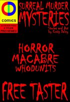
Surreal Murder Mysteries
Staff: Craig Daley
Overview:
A lot of effort, a little payout
Review:
Both the story and the art are by Craig Daley on this one. Let’s start by saying that the cover did little to inspire me. It was a plain black background background with default red text in the “Chiller” font.
The art is the first thing you notice. It’s not exactly professional grade. It looks like someone got a hold of Adobe Illustrator and just went for broke with little training. Some things have strokes while other things don’t, there is a painfully armature gradient on a lot of things, and it seems like a lot of this was just traced. I think the color pallet that was used was limited to the default pallet that come with the program rather than going for something better done. The whole art style lends itself to a lack of emotion, repeated faces (I think the redhead has 1 facial expression the the entire first story), and a disjointed feel in relation to the tone of the story. There is also this very odd situation where some characters have lips and others seem to not.
It wasn’t until page 6 that I lost it though. Suddenly David Duchovny’s traced face appeared on the page. I thought to myself, “What is Mulder doing here and why isn't Scully with him?”. Then the very next panel his face gains these massive eyes (in comparison) and I couldn't help but imagine chibi version of Fox Mulder. I could seriously identify the pictures on Google image search that this guy traced.
The first story says it will change the way I shop forever. It gives us a nice little suggestive opening page and then we hop the train to exposition town. A lot of the dialogue is handled very clunky (“He reckons that within a couple year this place will be opening Sundays.”). We get off at plot point station and end up in the township of “muddled murder mystery plot”. It ends on a supposed cliffhanger but because I was so devoid of anything resembling emotional investment in the characters (Ok… aside from chibi David Duchovny, but that was out of morbid curiosity).
The second story is a historical horror story. It starts off with a rhyme. It wasn't particularly good, but at least it showed an understanding of how to do so. It was better than the car ride of exposition we got in the first story. It’s a telling of the story of spring heeled jack with a dual timelines twist.
The third story spends a lot of pages on a soccer story that really doesn't go anywhere. It was context for the rest of the story, but it could have been summed up in about a page. Instead we have to sit through eight pages of it.
The fourth and final story involves missing villagers, spies, and UFOs. I won’t harp on it too much as it shares a lot of the same issues as the last one has (heavy on exposition in place of dialogue, drawn out introduction, etc).
The typography shows a lack of understandings of the fundamentals. It seems like he just tried to mimic what he has seen in other comics. It’s basically a white square with a black stroke and a carrot facing the speaker. The font was pretty plain, but at least it was legible.
Ultimately this comic shows something that very few do- genuine effort. It pains me that Craig didn't get a good team together for this. Some of the stories have genuine potential and could be very interesting, but fall flat on execution. I've done the whole Illustrator thing myself and this guy must have put some serious time and effort into it. If his skill matched his dedication to getting this comic out he’d be Frank Quitely. Unfortunately, he squanders and sort of talent he may have by trying to conquer this himself with no help. I’ve worked in the game development business and there is a common misconception that developing an idea is the hardest thing to do. I’d say it’s about 20% of the process and it doesn't mean anything if it’s not executed properly. This comic has some decent (I won’t say great) ideas that would work in a TV show like Law & Order, but are so poorly executed it’s akin to lighting the comic pages on fire. From the tracing to the unbelievable amount of exposition crammed into every panel, this comic falls flatter than the 2D images that were traced for this comic.
Metrics
Art: 1/10 (Traced images)
Lettering: 3/10 (At least you can read it)
Plot: 3/10 (Standard but exposition heavy)
Novelty: 4/10 (It's nothing really "new", just tropes rehashed.)
Overall: 2.75/10
Review from: http://indycomicreview.wordpress.com/
|
|
|
|
|
|
|
|
|
|
|
|